Feb 27th 2026
The Power of Color: How to Use Planter Colors to Enhance Your Landscape Design
Key Takeaways:
- The right planter colors guide movement, define zones, and create visual harmony across commercial spaces.
- Choose strategic planter box colors to soften hardscapes, highlight greenery, and reinforce brand identity.
- Use color in planter box landscaping to elevate functional spaces into cohesive, memorable environments.
Thoughtful designers know: the details make the difference. Even an untrained eye can sense when a space feels purely functional and when it pops.
In landscape design, plant selection, layout, and materials all matter, but effective use of color can be transformative. Your modern planter colors don’t just complement greenery; they elevate the whole environment, communicating both visual harmony and brand identity while guiding visitors through the space.
Understanding how to maximize the impact of color in your planter box landscaping plan enhances any type of project.
Why Planter Colors Matter
Color is one of the most powerful elements in a designer’s toolbox. In outdoor spaces, planter box colors interact with architecture, paving materials, natural vegetation, and other decorative features. The way you wield color creates harmony – or intentional contrast.
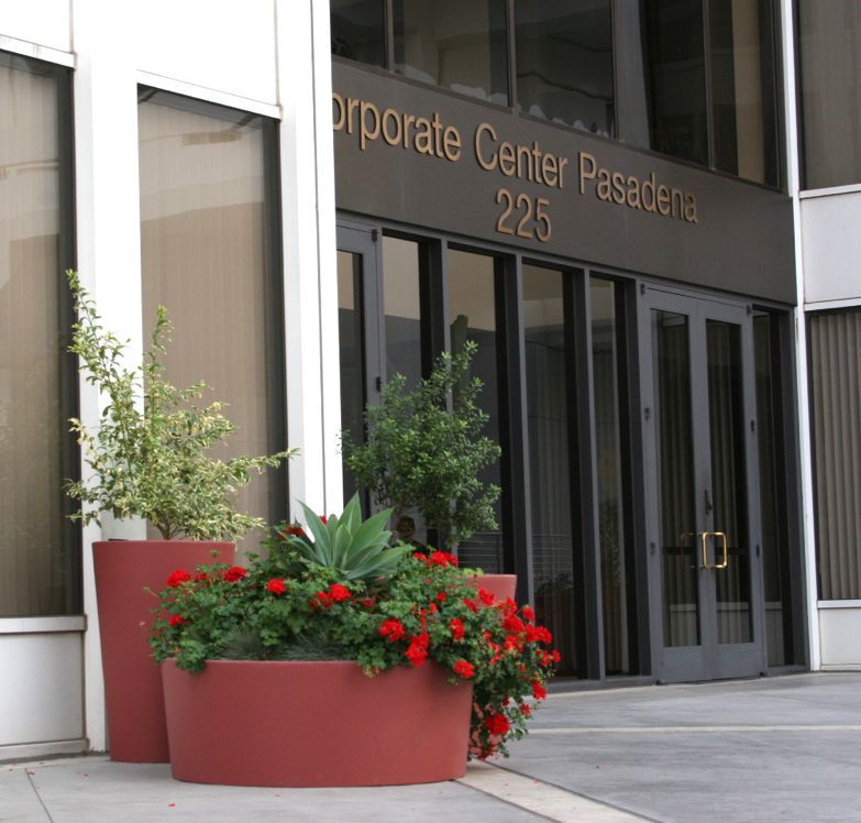
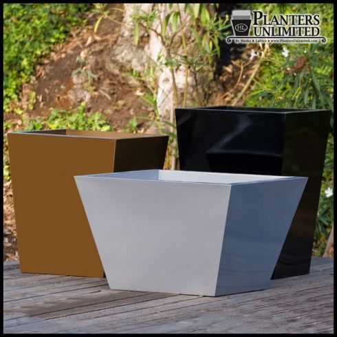
- Choose rich hues for your planters – like Planters Unlimited’s fiberglass Persimmon, Burgundy, or Hunter Green shades – and attention is drawn to specific areas.
- Opt for muted colors – such as our Madera White Oak or Drift tones, or Chenza or Tiza in our fiberstone finishes – and the plants themselves take center stage.
Color Cues
In high-traffic areas, planter box landscaping controls both visual flow and foot traffic. Well-chosen planter box colors can turn walkways into focal points and build engaging experiences.
Perfectly chosen planter colors enhance curb appeal, draw attention, and reinforce branding. They also foster a sense of cohesion between indoor and outdoor spaces, as design elements are carried through areas in a way that feels intentional.
Integrating Planter Colors With Hardscape Elements
In commercial landscaping, hardscape features tend to dominate. Asphalt and concrete walkways, wood or tile flooring, and metal and stone elements provide structure and are necessarily strong and durable. But without the interplay of softer design features, these hardscapes can feel cold or impersonal.
Greenery Isn’t an Afterthought; It’s an Essential
Designing with plants does more than add life and movement. It breaks up rigid lines to soften spaces and create more inviting atmospheres.
Planter colors play a pivotal role in this process. By complementing or contrasting with hardscapes, colorful planters can:
- Highlight foliage so the focus is on greenery and not on rigid design structures.
- Define zones, subtly delineating pathways or signaling gathering points.
- Create visual harmony between the built environment and natural elements.
Consider Your Planting Choices
Beyond their interaction with and elevation of surrounding hardscapes, planter colors engage with the plantings themselves. The planter box colors you choose can amplify the impact of what’s displayed within them.
Whites
Shades in the white family, from Pearl to light Khaki, provide a crisp, clean backdrop that makes bright blooms pop. Attention is drawn to the vibrancy of bold blossoms like lavender, petunias, and begonias.
Warm Neutrals
Planter colors that feel earthy and subdued create a subtle, organic framework to show off both lush greenery and muted foliage. Latte, Parchment, and Dove tones create visual cohesion, not distraction.
Bold Darks
Dramatic – yet still grounded – colors like Espresso, Charcoal, and Terra Cotta add exciting contrast. They are ideal for highlighting saturated blooms or variegated leaves, and they can help your planter box landscaping contribute a sense of depth in grand spaces.
Enhancing Brand Identity With Planter Box Colors
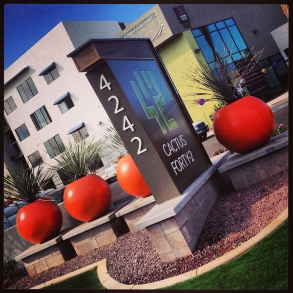
Commercial spaces often serve as extensions of a brand, and brand identity is inevitably tied to color. Planter colors offer an effective way to reinforce branding, building cohesion between the environment and business identity.
Hotels, restaurants, corporations, and school campuses typically have distinct colors baked into their images. Incorporating that palette into design elements like planter box landscaping creates a visual thread that ties back to the brand without feeling forced.
In shopping centers that house multiple brands, planter colors can reflect the overall personality of the space. A plaza that hosts upscale boutiques may feature deep, rich shades to evoke sophistication and elegance, while family shopping areas might incorporate lighter, warmer shades that feel approachable and inviting.
Do’s and Don’ts When Designing With Planter Colors
Taking a strategic approach to selecting planter box colors ensures they enhance a space rather than compete with it.
- DO create a color hierarchy. Establish primary, secondary, and accent tones so planter colors are in harmony.
- DON’T treat every planter like a statement piece. Too many bold colors competing for attention can be distracting.
- DO consider scale and placement. Use larger planters in strong palettes as focal points, and allow smaller containers in softer tones to create balance.
- DON’T ignore proportion. Dramatic colors may overpower small planters, while muted tones can seem to disappear when viewed from a distance.
- DO coordinate with surrounding materials. Align planter box colors with building finishes and site furnishings to maintain visual continuity.
- DON’T overlook ambient context. Consider how shadows, sun, and artificial light will affect the appearance of your planter box landscaping.
Bring Your Color Strategy to Life With Planters Unlimited
From bold statements to subtle sophistication, Planters Unlimited offers the planter colors and finishes to support your creative vision. Browse our selection of commercial outdoor planters, and see how the right containers can elevate every landscape you design.